1912_Summer_Olympics_poster

Going au natural was considered not only natural, but beautiful, in ancient Greece. The nude athlete is a powerful image in Greece. It is said that when a runner named Orsippus of Megara lost his loincloth in the midst of a sprint, he was said to run even faster, gaining him victory and fame. Running naked became a competitive advantage.

As archaeologists like Heinrich Schliemann, who uncovered the site of ancient Troy in the late 19th century, captured the imagination of people the world over, the thinking and customs of the ancient Greece became idealized. The nude athlete in particular was de rigeur in posters advertising the early Olympic Games.

1920 antwerp olympics poster

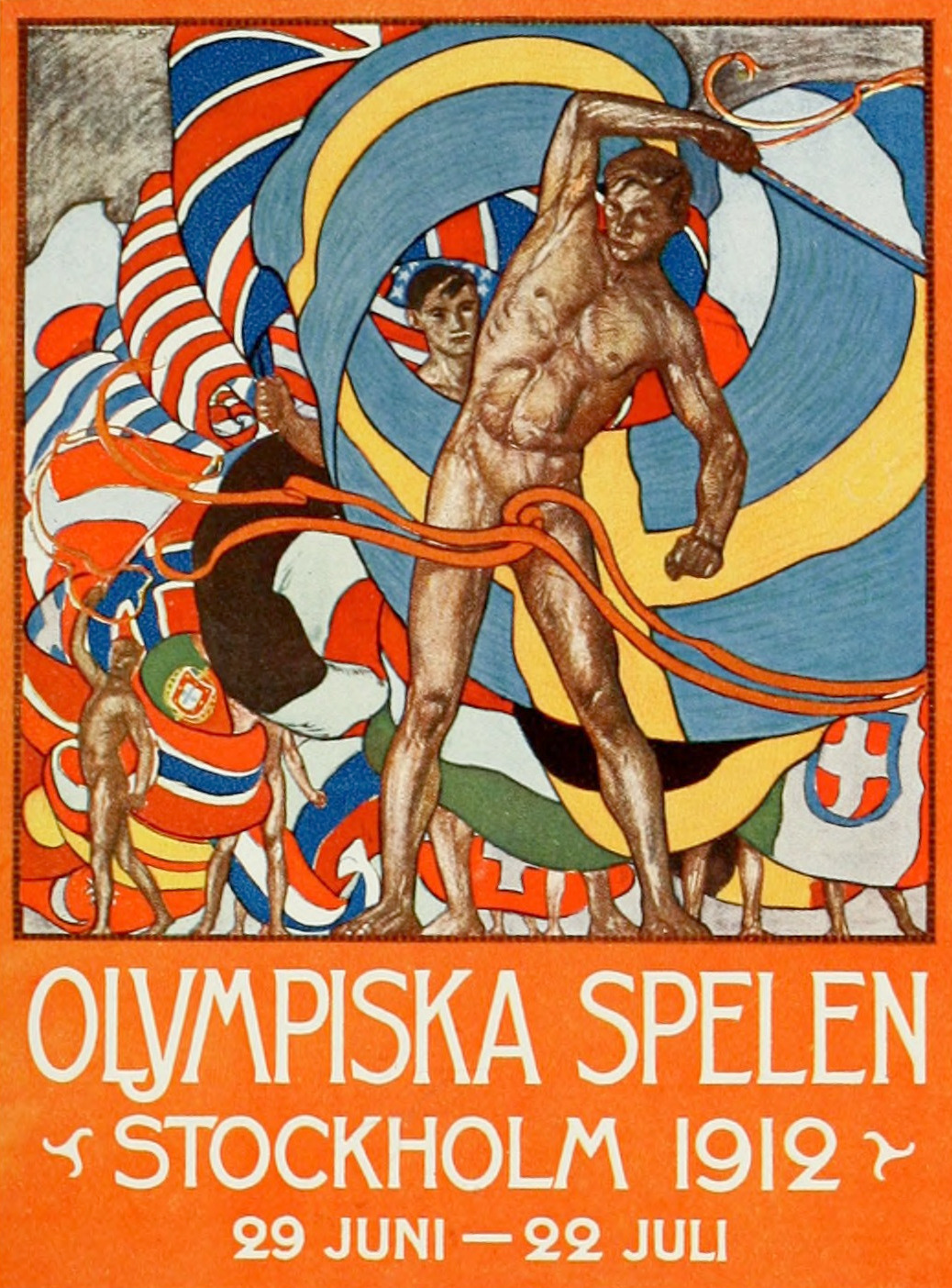
In fact, from 1912 to 1936, the male body was the main feature of the Olympic poster, with the 1912 Stockholm Olympic poster being the most, how shall we say, intriguing, showing that there’s a lot you can do with a ribbon. And after World War I ravaged Europe, the Olympics came to Antwerp, Belgium in 1920, where the poster also employed a fully nude man, private parts covered this time by a swirling towel.

1924 Paris Olympics poster

The French were not so revealing, but the poster for the 1924 Paris Olympics did emphasize the bare chests and midriffs of virile young men ready to go into athletic battle. The poster for the 1928 Amsterdam Olympics was less suggestive, but still featured a yearning half-nude man.

Then, there are the prudish Americans, who featured a man of chiseled musculature, but whose torso was covered by a white t-shirt.

The Germans in 1936, the Brits in 1948 and the Finns in 1952 all did variations on a theme with the male body, until the Aussies came along and changed the look and feel dramatically. They removed the human, and replaced it with, what looks like a card, or invitation to the Olympic Games.

Nude guys were no longer a thing.

1932 Los Angeles Olympics poster

Monster Strike Kaekura memem
The Monster Strike mobile game ad in the Yamanote train in June, 2017.

I was on the Yamanote Line train when I looked up to see all in-car advertisements devoted to Japan’s #1 best-selling mobile game from 2016 – Monster Strike. I usually don’t care about mobile games, but the ad immediately caught my attention – animals in mid-stride racing together, on a dark black background.

It is exactly the same concept as the second of designer Yusaku Kamekura‘s poster in 1962, marketing the 1964 Tokyo Olympics to come.

Kamekura emblem design_2

That same evening, I see a television commercial for a logistics company called Kuroneko Yamato, with nearly the exact same design concept. Kuroneko means “black cat”, so with a black cat leading five Kuroneko transportation men in a sprint, they put the bodies in action on a yellow background instead. And yet the nod to Kamekura’s poster design is unmistakable.

Kuro Neko Shinka
Kuroneko Takkyubin Ad

After Kamekura settled on a design for their second Tokyo Olympics poster (click here to see the first design that won Kamekura the Olympic account), he assigned Osamu Hayasaki as the photographer, and Jo Murakoshi as the director of the project. The idea was to employ photography for the second photo, instead of the mainstream use of illustrations.

Their idea must have been to capture the idea of speed and power, so they arranged to have men from the US Military (from the airbase in Tachikawa as I believe someone once told me) dress in track gear, and move as if exploding from starting blocks. As this site explains, they employed four photographers to snap a shot of the runners in motion, in the dark, pressing the shutter button just as they flashed strobe lights.

It is said that it took over 80 takes to get just the right balance for that poster.

And over 50 years later, this meme lives on.

Rio Closing Ceremony_3
From the 2016 Rio Olympics closing ceremony video tribute to Tokyo 2020