
The next best thing to words are symbols. The signs for men and women’s toilets come in a gazillion varieties, but they are most often a variation of a theme. Symbols, if done right, can cut to the chase.

With a continued increase in foreign tourists to Japan, and a spike in international guests in Tokyo during the 2020 Olympics expected, the Geospatial Information Authority of Japan (GSI) released a new set of map symbols which they believe will be more intuitively understood by visitors. The old map symbols included an “X”. In the West, “X” may mark the spot of treasure, but in Japan, it meant police station. The old map represented a temple with a swastika, which is too much of an emotional jolt to many with its strong association with Nazism, despite its far longer association with Hinduism and Buddhism.
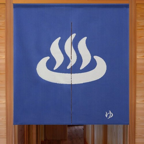
Fortunately, the GSI decided not to replace the symbol for onsen. The three wavy steamy lines bathing in an oval is a personal favorite.
The pictograms of today were born out of the pictograms of the 1964 Tokyo Olympics. These Games were the first to be held in Asia, and Japan realized they had a language problem. In addition to translation, designers figured that use of symbols would be a powerful and efficient way to get foreigners to the right place. In fact, the Tokyo Olympics proved to be filled with design opportunities for the best in the country as the ’64 Games were essentially the first time an Olympic Games systematically used pictograms to represent each of the sporting events, or direct people to places.
As this blog post states, “…for such a huge national event, needless to say the design side of things was very important too and it engaged the talents of the industry heavyweights at the time.” One of the heavyweights was Yoshiro Yamashita, who designed these event symbols.

The symbols that represented facilities were said to have been created by a team of ten designers.

You must be logged in to post a comment.