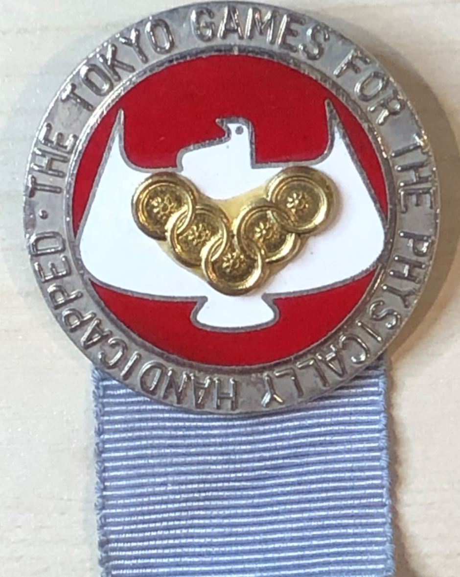
The 1964 Tokyo Paralympics were a landmark Games – in fact, they were the first to be called a Paralympics.
The above picture is of an official pin for the 1964 Tokyo Paralympics, with the logo of a white dove and 5 circles interlocking in a “V” formation.
As explained to me by the records and information manager of the International Paralympic Committee (IPC), the dove represents “peace as well as love.” 

This logo is somewhat based on the logo for the Stoke Mandeville Games of 1960, held in Rome, which was a design of three interlocking wheelchair wheels. The 1964 version used five interlocking wheelchair wheels, but this time in a way similar to the Olympic rings, which the International Olympic Committee (IOC) objected to.
Today, the relationship between the IOC and the IPC is solid. Planning for both Tokyo2020 events are done in tandem. Official sponsors sign up to support both the Olympic and Paralympic Games. But in the past, that was not the case. And the design of the Paralympics logo is a case in point, according to the records and information manager.
The history of the Games’ logos is one that is marked by a relationship to the IOC that was not always as good as it is today. Multiple designs for logos were vetoed, as they too closely resembled the Olympic logo at a time when the IOC did not wish to be associated with the Paralympic Games.
At the 1988 Seoul Paralympics, the organizers designed a logo that featured five tear-shaped symbols which are apparently a common feature of Korean decorative art known as “Pa.” The designer arranged those five tears in a way similar to the Olympic rings.
And again, the IOC objected, resulting in a logo that contained three Pa in red, green and blue. This particular version was used by the IPC from 1994 to 2004, before morphing into a version of the IPC “Agitos” logo Paralympians are familiar with today.
You must be logged in to post a comment.